Appearance
Countdown timer
The countdown timer counts down the days, hours, minutes and seconds to a date you set: a product launch, the end of a sale or an event. When the time is up, it can show a message, hide the clock, or hide the whole section.

Find it in the editor
On the home page, it is in the Template list. To add it to any page, click Add section and choose Countdown timer.

Important
A new countdown has no date, so customers don't see it until you enter one in End date. The editor reminds you with a note in the preview.
Section settings
General
| Setting | Description |
|---|---|
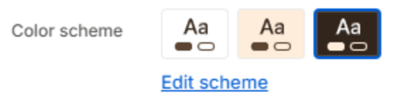
| Color scheme | The colors of this section. Schemes are edited in Theme settings → Colors. |
Layout

| Setting | Description |
|---|---|
| Layout | Stacked puts the heading above the clock; Copy beside clock puts them side by side on screens from 1024px. |
Section header

| Setting | Description |
|---|---|
| Subheading | A short line above the heading, with a small dash beside it. |
| Heading | The heading. Leave it empty to hide it. |
| Heading size | Medium or Large. Shown when the heading has text. |
| Backdrop word | A large outlined word behind the heading. One short word works best; it sizes itself to fit. |
| Description | A short text under the heading. |
| Alignment | Aligns the header to the left, center or right. |
| Alignment on mobile | The alignment below 768px. Same as desktop keeps the alignment above. |
| Header width | How wide the heading and description may run: Narrow, Medium, Wide or Full width. |
Content

| Setting | Description |
|---|---|
| Text | A short line under the heading. |
Countdown
| Setting | Description |
|---|---|
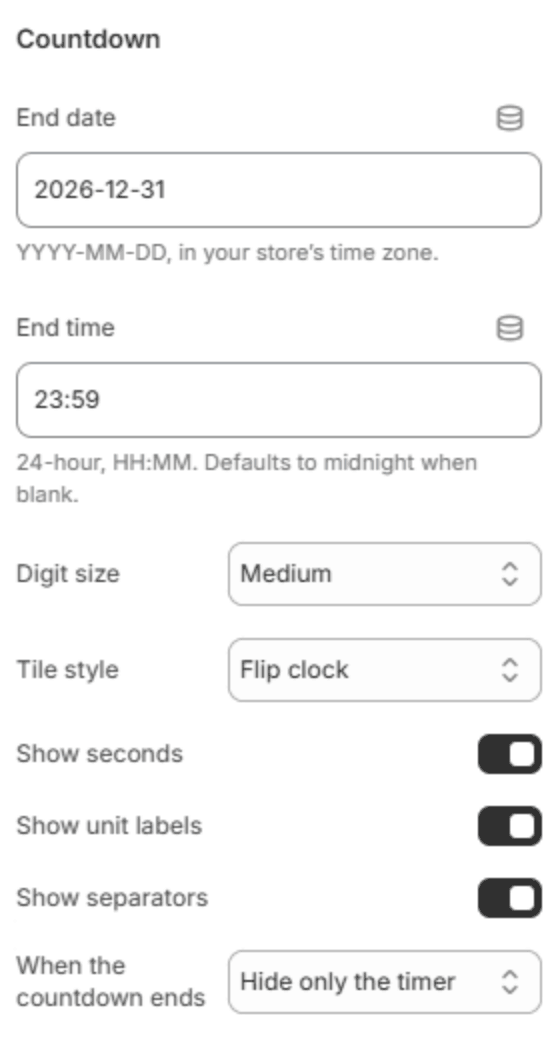
| End date | The day the countdown ends, written as YYYY-MM-DD, for example 2026-12-31. It uses your store's time zone, from Settings → General in the Shopify admin. |
| End time | The time on that day, in 24-hour HH:MM, for example 18:00. Leave it blank for midnight. |
| Digit size | Small, Medium or Large. |
| Tile style | How each number is drawn: Flip clock, a Solid tile, an Outlined tile, or Numbers only. |
| Show seconds | Shows the seconds as well as days, hours and minutes. |
| Show unit labels | Shows Days, Hours, Minutes and Seconds under the numbers. |
| Show separators | Shows a colon between the numbers. |
| When the countdown ends | Show a message in place of the clock, Hide the section, or Hide only the timer and keep the heading, text and button. |
| Message | The message shown in place of the clock once the time is up. Shown when When the countdown ends is Show a message. |
Background

| Setting | Description |
|---|---|
| Background image | A picture behind the section. |
| Background color | A color behind the section. Leave it blank to use the color scheme. Shown when there is no background image. |
| Overlay color | The color that darkens the picture. Shown when there is a background image. |
| Overlay opacity | How dark the overlay is (0–100%). Shown when there is a background image. |
| Parallax effect | The picture moves a little slower than the page as it scrolls. Desktop only. Shown when there is a background image. |
| Parallax depth | How much the picture moves (4–20). Shown when Parallax effect is on. |
Color overrides

Leave these blank to follow the color scheme. Fill one only where a color has to stand out over your picture.
| Setting | Description |
|---|---|
| Heading color | The heading's color. |
| Text color | The text's color. |
| Tile color | The color of the number tiles. |
| Digit color | The color of the numbers. |
| Separator color | The color of the colons. |
Button

| Setting | Description |
|---|---|
| Button label | The button's text. Leave it empty to hide the button. |
| Button link | The page it opens. Shown when it has a label. |
| Button style | Solid or Outlined. Shown when it has a label. |
| Alignment | Aligns the button to the left, center or right. Shown when it has a label. |
| Alignment on mobile | The alignment below 768px. Same as desktop keeps the alignment above. Shown when it has a label. |
Section spacing

| Setting | Description |
|---|---|
| Use custom spacing | Gives this section its own top and bottom spacing. Off, it uses Section spacing from Theme settings → Layout. |
| Top spacing | Space above the section (0–200px). Phones get 60% of it and tablets 80%. Shown when Use custom spacing is on. |
| Bottom spacing | Space below the section (0–200px). Phones get 60% of it and tablets 80%. Shown when Use custom spacing is on. |