Appearance
Product bundle
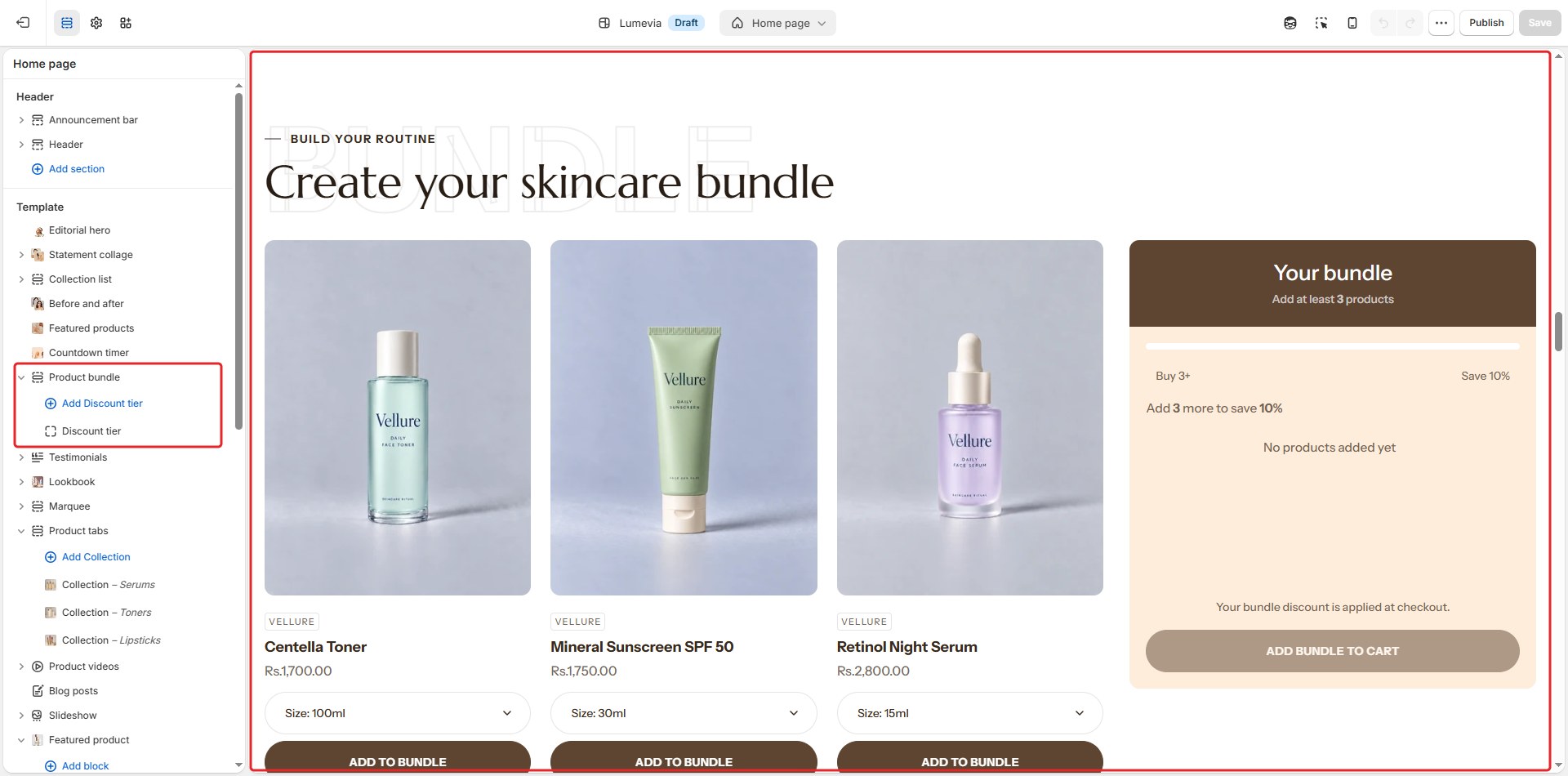
The product bundle lets customers build their own set: they pick products from a grid, choose a size or shade for each, and watch their bundle fill up in a summary beside the grid. Discount tiers, such as Buy 3+, save 10%, show how much more to add for the next saving. Add bundle to cart adds every product at once.

Find it in the editor
On the home page, it is in the Template list. To add it to any page, click Add section and choose Product bundle. Each discount tier is a Discount tier block inside it.
Important
The discount itself is created in the Shopify admin. The section only shows the tiers; Shopify applies the discount at checkout. Until you have created a matching automatic discount for every tier and turned on Show discounts, the section shows no discounts at all, so customers are never promised a saving they won't get. See Bundle discounts.
Section settings
General

| Setting | Description |
|---|---|
| Color scheme | The colors of this section. Schemes are edited in Theme settings → Colors. |
Layout
| Setting | Description |
|---|---|
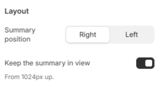
| Summary position | Puts the bundle summary on the Right or Left of the products. |
| Keep the summary in view | The summary stays in view while the customer scrolls through the products. On screens from 1024px. |
Section header
| Setting | Description |
|---|---|
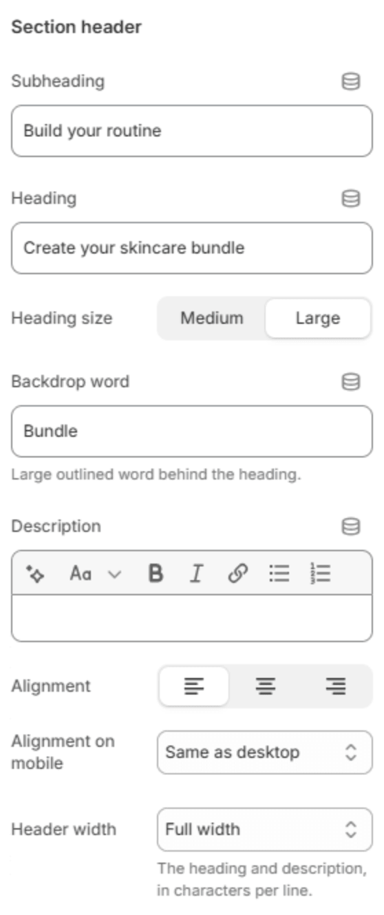
| Subheading | A short line above the heading, with a small dash beside it. |
| Heading | The heading. Leave it empty to hide it. |
| Heading size | Medium or Large. Shown when the heading has text. |
| Backdrop word | A large outlined word behind the heading. One short word works best; it sizes itself to fit. |
| Description | A short text under the heading. |
| Alignment | Aligns the header to the left, center or right. |
| Alignment on mobile | The alignment below 768px. Same as desktop keeps the alignment above. |
| Header width | How wide the heading and description may run: Narrow, Medium, Wide or Full width. |
Products

| Setting | Description |
|---|---|
| Products | The products customers can choose from. |
| Or a collection | A collection to choose from instead. Used when no products are chosen above. |
| Products to show | How many products the grid shows at most (2–20). |
| Columns on a large screen | How many products fit in a row (2–4). Four can show as three with a narrow page width or wide side margins, so no card gets too slim to read. |
| Columns on a phone | 2 columns or 1 column. |
Product cards
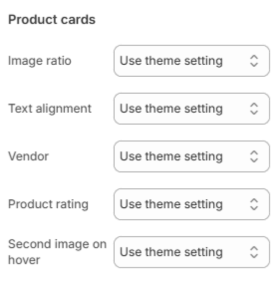
These change the cards of this section only. Use theme setting follows Theme settings → Product cards.
| Setting | Description |
|---|---|
| Image ratio | The shape of the product pictures: Square (1:1), Portrait (3:4) or Adapt to image. |
| Text alignment | Lines the card's text up on the Left, Center or Right. |
| Vendor | Show or Hide the vendor. |
| Product rating | Show or Hide the star rating. |
| Second image on hover | Show or Hide the second picture when the pointer is on a card. |
Bundle rules

| Setting | Description |
|---|---|
| Minimum items | How many items the bundle needs before it can be added to the cart (1–20). |
| Maximum items | The most items a bundle can hold (1–30). Keep it above the minimum. |
| Maximum of each product | How many of one product a bundle can hold (1–50). |
Discounts
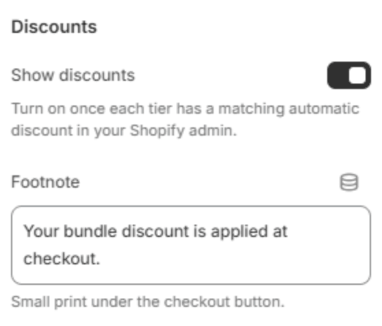
| Setting | Description |
|---|---|
| Show discounts | Shows the discount tiers, the saving and the discounted total. Turn it on only once every tier has a matching automatic discount in your Shopify admin. |
| Footnote | Small print under the button, for example Discount is applied automatically at checkout. Shown when Show discounts is on. |
Section spacing

| Setting | Description |
|---|---|
| Use custom spacing | Gives this section its own top and bottom spacing. Off, it uses Section spacing from Theme settings → Layout. |
| Top spacing | Space above the section (0–200px). Phones get 60% of it and tablets 80%. Shown when Use custom spacing is on. |
| Bottom spacing | Space below the section (0–200px). Phones get 60% of it and tablets 80%. Shown when Use custom spacing is on. |
Blocks
Discount tier
One step of the discount ladder. Add tiers with Add Discount tier under the section in the sidebar, in order from the smallest bundle to the largest.

| Setting | Description |
|---|---|
| Items required | How many items the bundle needs for this tier (1–30). |
| Discount | The percentage off at this tier (1–90%). It must match the automatic discount you create for it. |
Note
In the theme editor, the section warns you when the tiers are out of order, or when the minimum is higher than the maximum, so the bundle could never be added.