Appearance
Featured product
Featured product brings a full product to any page: the gallery, the price, the options and Add to cart, so customers can buy without opening the product page. Use it to launch a new product on the home page or to anchor a landing page.

Find it in the editor
Click Add section and choose Featured product, then pick the product in Product. The details column is built from blocks, like the product page.

Section settings
General

| Setting | Description |
|---|---|
| Color scheme | The colors of this section. Schemes are edited in Theme settings → Colors. |
Product
| Setting | Description |
|---|---|
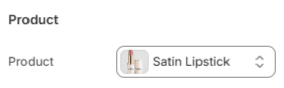
| Product | The product to feature. Until you choose one, a sample product holds the space. |
Section header
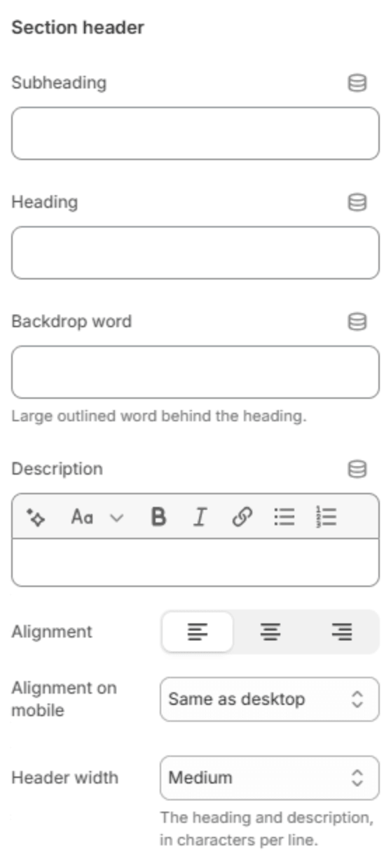
An optional header above the product.
| Setting | Description |
|---|---|
| Subheading | A short line above the heading, with a small dash beside it. |
| Heading | The heading. Leave it empty to hide it. |
| Heading size | Medium or Large. Shown when the heading has text. |
| Backdrop word | A large outlined word behind the heading. One short word works best; it sizes itself to fit. |
| Description | A short text under the heading. |
| Alignment | Aligns the header to the left, center or right. |
| Alignment on mobile | The alignment below 768px. Same as desktop keeps the alignment above. |
| Header width | How wide the heading and description may run: Narrow, Medium, Wide or Full width. |
Layout
| Setting | Description |
|---|---|
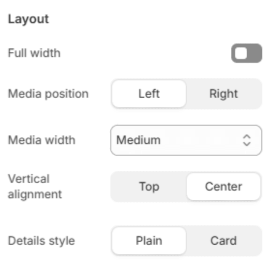
| Full width | Runs the section from edge to edge instead of within the page width. |
| Media position | Puts the gallery on the Left or Right of the details. |
| Media width | How much of the width the gallery takes: Small, Medium or Large. |
| Vertical alignment | Lines the details up with the Top or the Center of the gallery. Shown unless the gallery is a mosaic or a grid. |
| Details style | Plain sets the details on the section's background; Card puts them on a raised card. |
Media
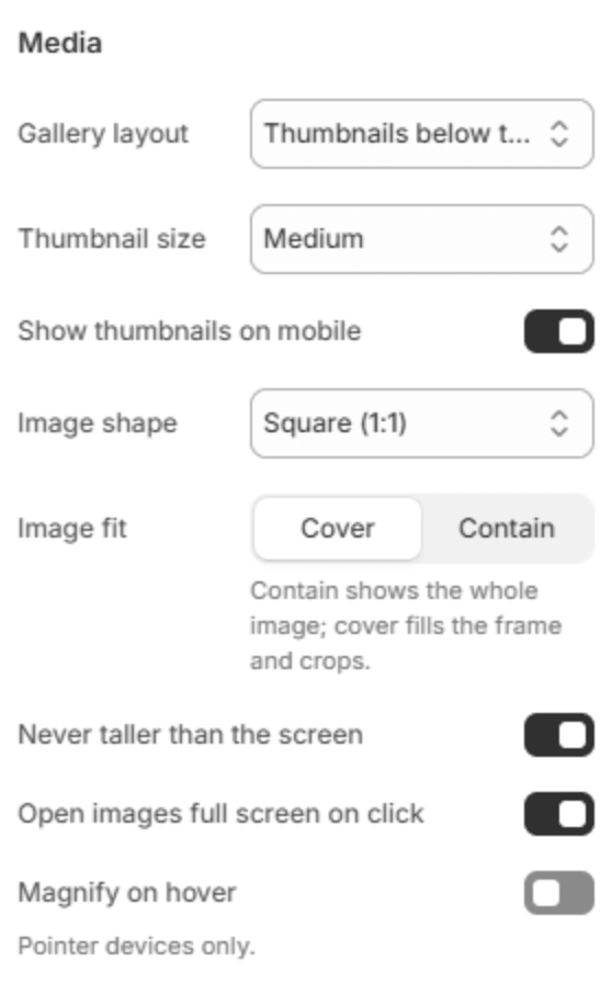
These work as on the product page; see Product page → Media.
| Setting | Description |
|---|---|
| Gallery layout | One large image with Thumbnails below the image, left of the image or right of the image; a Mosaic; or a Grid. |
| Thumbnail size | Small, Medium or Large. Shown for the thumbnail layouts. |
| Show thumbnails on mobile | Shows the thumbnails on phones. Shown for the thumbnail layouts. |
| Grid columns | 1 or 2. Shown when Gallery layout is Grid. |
| Image shape | Square (1:1), Portrait (4:5), Portrait (3:4) or Adapt to first image. |
| Image fit | Cover fills the shape and crops; Contain shows the whole image. |
| Never taller than the screen | Keeps the main image short enough to fit the screen. Shown for the thumbnail layouts. |
| Open images full screen on click | Clicking an image opens it full screen. |
| Magnify on hover | Magnifies the part of the image under the pointer. Computers only. |
| Magnification | How much it magnifies (120–250%). Shown when Magnify on hover is on. |
Video

| Setting | Description |
|---|---|
| Play automatically | Starts the product's videos as soon as they are shown, without sound. |
| Loop | Plays a video again from the start when it ends. |
| Show player controls | Shows the play, pause and progress controls. |
Buying

| Setting | Description |
|---|---|
| Show dynamic checkout buttons | Shows Shop Pay, PayPal and the other express checkout buttons your store accepts. |
| Buy it now button | Outlined, Same as Add to cart, or Shopify default. Shop Pay, PayPal and Apple Pay keep their own brand colors. Shown when dynamic checkout buttons are on. |
Section spacing

| Setting | Description |
|---|---|
| Use custom spacing | Gives this section its own top and bottom spacing. Off, it uses Section spacing from Theme settings → Layout. |
| Top spacing | Space above the section (0–200px). Phones get 60% of it and tablets 80%. Shown when Use custom spacing is on. |
| Bottom spacing | Space below the section (0–200px). Phones get 60% of it and tablets 80%. Shown when Use custom spacing is on. |
Blocks
Featured product uses the same blocks as the product page's details column: Vendor name, Title, Price, Rating, SKU, Text, Description, Stock warning, Variant options, Quantity selector, Buy buttons, Pickup availability, Icon with text, Countdown timer, Collapsible row, Share icons and Custom Liquid. Their settings are described in Product page → Blocks. Two differ here:
Description

| Setting | Description |
|---|---|
| Length | How much of the description shows: the Full description, or the first 2, 3, 4 or 6 lines. |
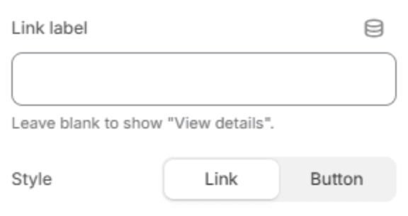
View details link
A link to the product's own page, for customers who want every detail.
| Setting | Description |
|---|---|
| Link label | The link's text. Leave it empty to show View details. |
| Style | A text Link with an arrow, or a Button. |