Appearance
Featured products
Featured products shows products from one collection, as a carousel or a grid, with a heading and a View all button that opens the collection. Use it for new arrivals, bestsellers or a seasonal edit.

Find it in the editor
On the home page, it is in the Template list. To add it to any page, click Add section and choose Featured products.

Section settings
General

| Setting | Description |
|---|---|
| Color scheme | The colors of this section. Schemes are edited in Theme settings → Colors. |
Layout
| Setting | Description |
|---|---|
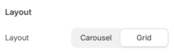
| Layout | Carousel keeps the products in one row that customers swipe or scroll; Grid shows them all at once, in rows. |
Section header

| Setting | Description |
|---|---|
| Subheading | A short line above the heading, with a small dash beside it. |
| Heading | The heading. Leave it empty to hide it. |
| Heading size | Medium or Large. Shown when the heading has text. |
| Backdrop word | A large outlined word behind the heading. One short word works best; it sizes itself to fit. |
| Description | A short text under the heading. |
| Alignment | Aligns the header to the left, center or right. The View all button follows it: opposite the heading when it is left or right, and centered under it when it is centered. |
| Alignment on mobile | The alignment below 768px. Same as desktop keeps the alignment above. |
| Header width | How wide the heading and description may run: Narrow, Medium, Wide or Full width. |
Products
| Setting | Description |
|---|---|
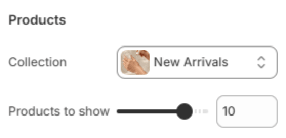
| Collection | The collection whose products are shown, in the collection's own order. Until you choose one, sample cards hold the space. |
| Products to show | How many products to show at most (2–12). |
Columns
| Setting | Description |
|---|---|
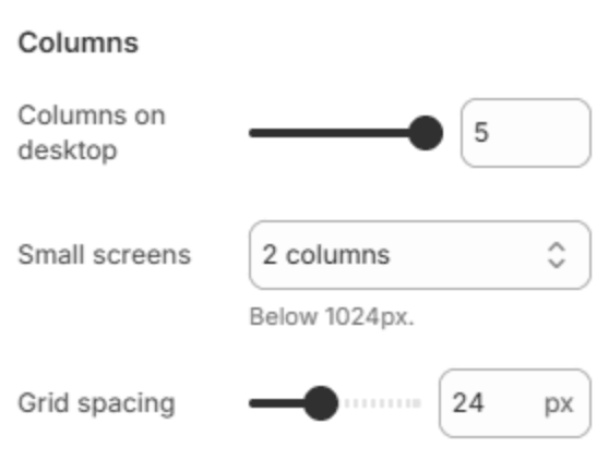
| Columns on desktop | How many products fit in a row on a large screen (2–5). Smaller screens show fewer. |
| Small screens | Below 1024px, a grid can become a Carousel, stay as 2 columns, or stack as 1 column. Shown when Layout is Grid. |
| Columns on mobile | How many products fit across a phone in a carousel: 1, or 1.2 (a peek), which shows part of the next product so customers can see the row scrolls. |
| Grid spacing | The space between products (8–48px). |
Product cards

These change the product cards of this section only. Use theme setting follows Theme settings → Product cards.
| Setting | Description |
|---|---|
| Image ratio | The shape of the product pictures: Square (1:1), Portrait (3:4) or Adapt to image. |
| Text alignment | Lines the card's text up on the Left, Center or Right. |
| Vendor | Show or Hide the vendor. |
| Product rating | Show or Hide the star rating. |
| Quick view | Show or Hide the quick view button. |
| Second image on hover | Show or Hide the second picture when the pointer is on a card. |
Carousel
These settings show when the section is a carousel on any screen.

| Setting | Description |
|---|---|
| Show arrows | Shows the previous and next arrows. |
| Show dots | Shows a row of dots under the carousel, one for each position. |
Button
| Setting | Description |
|---|---|
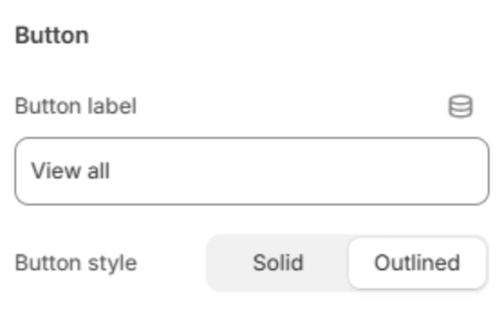
| Button label | The text of the button that opens the collection, for example View all. Leave it empty to hide the button. It shows once a collection is chosen. |
| Button style | Solid or Outlined. Shown when the button has a label. |
Section spacing

| Setting | Description |
|---|---|
| Use custom spacing | Gives this section its own top and bottom spacing. Off, it uses Section spacing from Theme settings → Layout. |
| Top spacing | Space above the section (0–200px). Phones get 60% of it and tablets 80%. Shown when Use custom spacing is on. |
| Bottom spacing | Space below the section (0–200px). Phones get 60% of it and tablets 80%. Shown when Use custom spacing is on. |