Appearance
Before and after
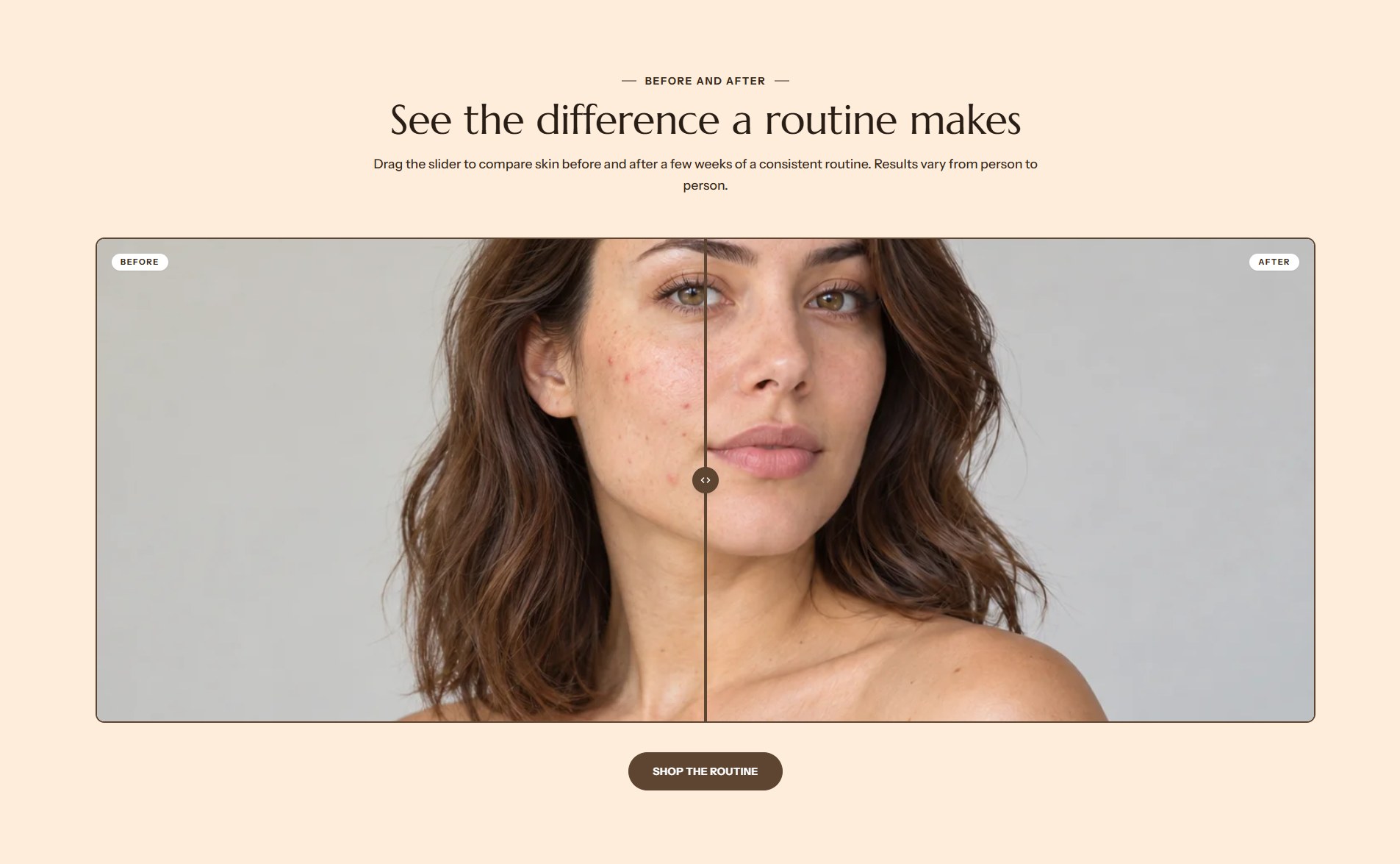
Before and after shows two pictures of the same subject, one on top of the other, with a divider customers drag to compare them. Use it to show a result, a texture or a shade.
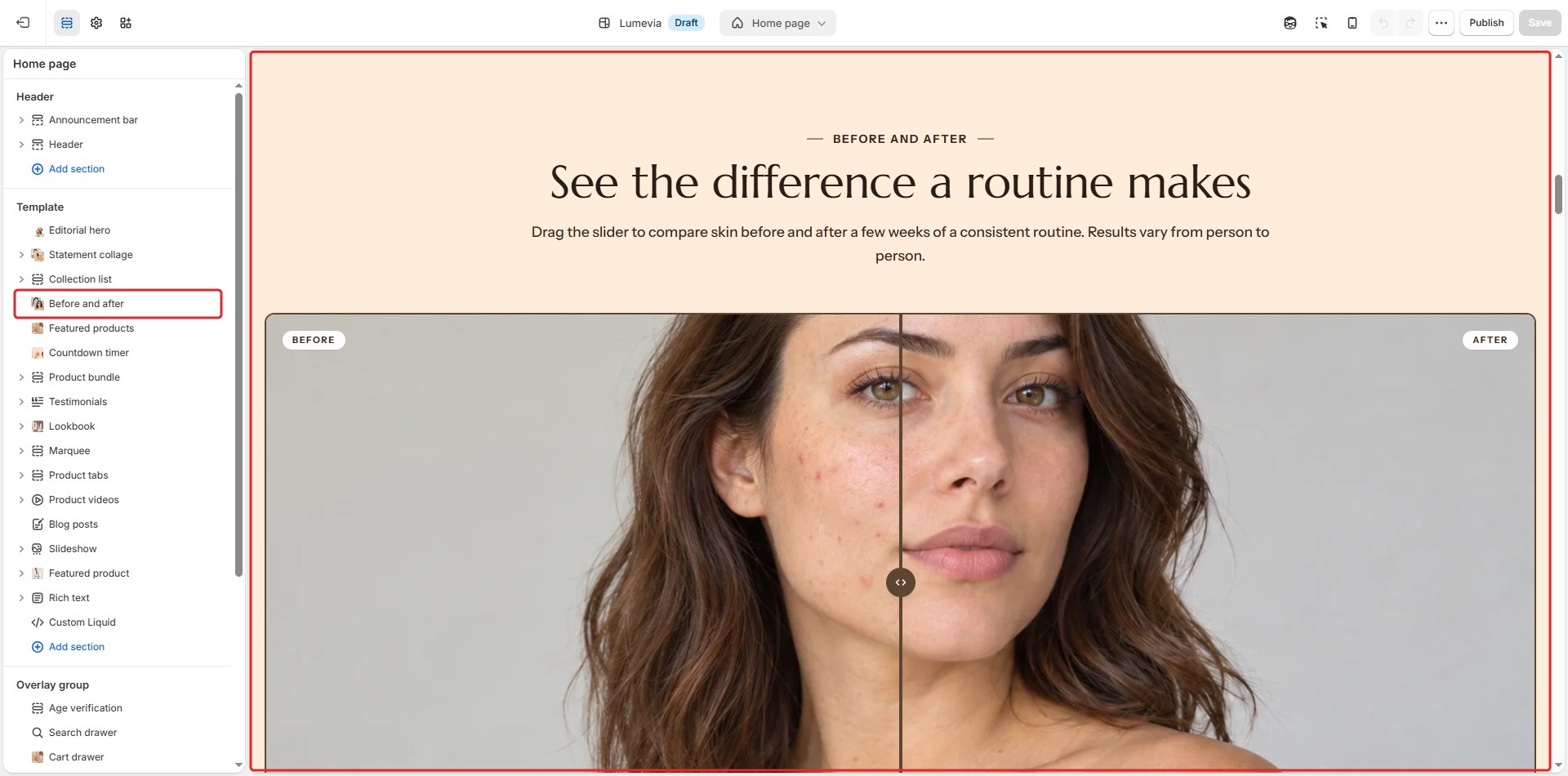
Find it in the editor
On the home page, it is in the Template list. To add it to any page, click Add section and choose Before and after.
Section settings
General
| Setting | Description |
|---|---|
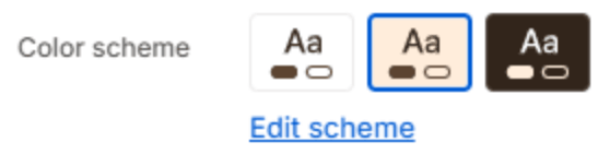
| Color scheme | The colors of this section. Schemes are edited in Theme settings → Colors. |
Layout

| Setting | Description |
|---|---|
| Layout | Where the heading and text sit: Text on the left, Text on the right, or Text above the pictures. |
| Frame height | How tall the pictures are: Small, Medium or Large. |
Section header

| Setting | Description |
|---|---|
| Subheading | A short line above the heading, with a small dash beside it. |
| Heading | The heading. Leave it empty to hide it. |
| Heading size | Medium or Large. Shown when the heading has text. |
| Backdrop word | A large outlined word behind the heading. One short word works best; it sizes itself to fit. |
| Description | A short text under the heading. |
| Alignment | Aligns the header to the left, center or right. |
| Alignment on mobile | The alignment below 768px. Same as desktop keeps the alignment above. |
| Header width | How wide the heading and description may run: Narrow, Medium, Wide or Full width. |
Images
| Setting | Description |
|---|---|
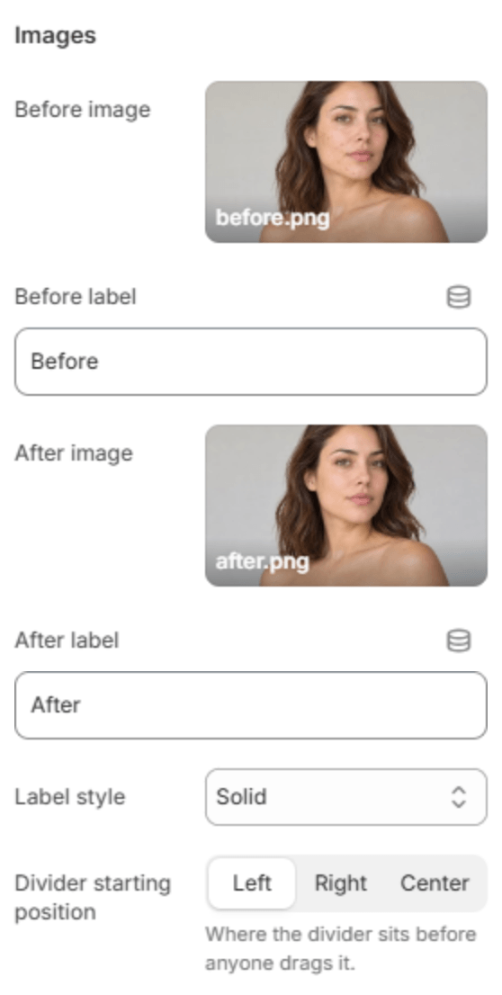
| Before image | The first picture. Use the same size and framing for both pictures, so the divider lines them up. |
| Before label | The label on the first picture. |
| After image | The second picture. |
| After label | The label on the second picture. |
| Label style | Glass, frosted over the picture; Solid; Plain text; or Hidden. |
| Divider starting position | Where the divider sits before anyone drags it: Left, Right or Center. |
Button

| Setting | Description |
|---|---|
| Button label | The button's text. Leave it empty to hide the button. |
| Button link | The page it opens. Shown when it has a label. |
| Button style | Solid or Outlined. Shown when it has a label. |
| Alignment | Aligns the button to the left, center or right. Shown when it has a label. |
| Alignment on mobile | The alignment below 768px. Same as desktop keeps the alignment above. Shown when it has a label. |
| Button position | With the heading or Below the picture, on a large screen. Shown when Layout is Text above. |
Section spacing

| Setting | Description |
|---|---|
| Use custom spacing | Gives this section its own top and bottom spacing. Off, it uses Section spacing from Theme settings → Layout. |
| Top spacing | Space above the section (0–200px). Phones get 60% of it and tablets 80%. Shown when Use custom spacing is on. |
| Bottom spacing | Space below the section (0–200px). Phones get 60% of it and tablets 80%. Shown when Use custom spacing is on. |
Note
Customers drag the divider with a mouse or a finger, and keyboard users move it with the arrow keys.