Appearance
Product recommendations
Product recommendations shows other products on a product page. Shopify chooses them for each product: related products are worked out automatically from your catalog and orders, and complementary products are the ones you pair up yourself in the Search & Discovery app.

Find it in the editor
On the product page, it is in the Template list. It can be added to product templates only, with Add section → Product recommendations.

Section settings
General
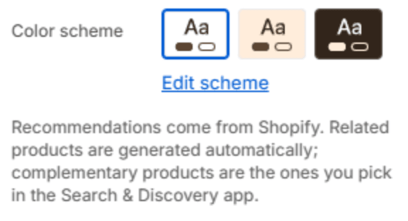
| Setting | Description |
|---|---|
| Color scheme | The colors of this section. Schemes are edited in Theme settings → Colors. |
Section header
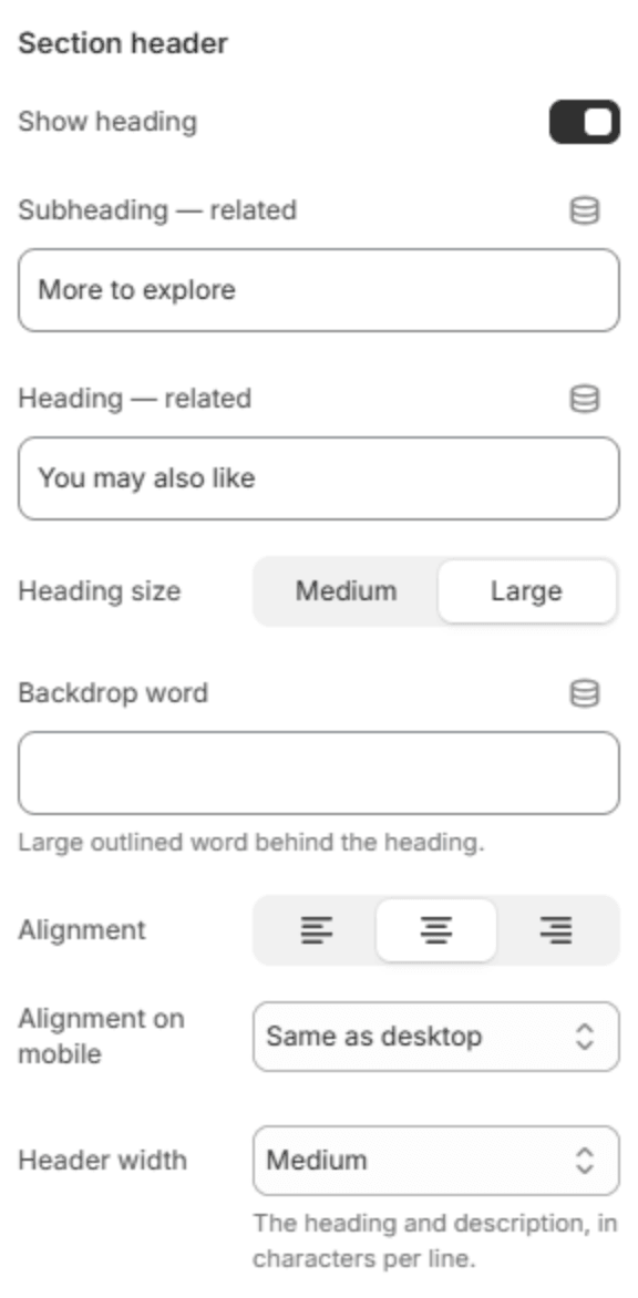
The section has a heading for each kind of recommendation, and shows the pair that matches Which recommendations.
| Setting | Description |
|---|---|
| Show heading | Shows the subheading and heading above the products. |
| Subheading — related | The line above the heading for related products. |
| Heading — related | The heading for related products, for example You may also like. |
| Subheading — complementary | The line above the heading for complementary products. |
| Heading — complementary | The heading for complementary products, for example Goes well with. |
| Heading size | Medium or Large. |
| Backdrop word | A large outlined word behind the heading. |
| Alignment | Aligns the header to the left, center or right. |
| Alignment on mobile | The alignment below 768px. Same as desktop keeps the alignment above. Shown when Show heading is on. |
| Header width | How wide the heading may run: Narrow, Medium, Wide or Full width. |
Content

| Setting | Description |
|---|---|
| Which recommendations | Related products come from Shopify automatically. Complementary products are the ones you pair up in the Search & Discovery app; see Pairs well with. |
| How many | How many products to show (2–10). |
Layout

| Setting | Description |
|---|---|
| Layout | Carousel shows product cards in a row; Compact list shows small rows of picture, title and price. |
| Columns on desktop | How many cards fit in a row (2–5). Shown when Layout is Carousel. |
Carousel
These settings show when Layout is Carousel.

| Setting | Description |
|---|---|
| Show arrows | Shows the previous and next arrows. |
| Show dots | Shows a row of dots under the carousel, one for each position. |
Section spacing

| Setting | Description |
|---|---|
| Use custom spacing | Gives this section its own top and bottom spacing. Off, it uses Section spacing from Theme settings → Layout. |
| Top spacing | Space above the section (0–200px). Phones get 60% of it and tablets 80%. Shown when Use custom spacing is on. |
| Bottom spacing | Space below the section (0–200px). Phones get 60% of it and tablets 80%. Shown when Use custom spacing is on. |
Note
A new store has few orders, so Shopify may have little to recommend at first. The section stays hidden for a product with no recommendations, and fills in as your store grows.